Benedict Drew @ Walker Art Gallery
GDLP
Emoji summary: 🚀🚫💥
Last week I tweeted on @thewhitepube that ‘people confuse taste n quality too often. Like just because something is not your thing, doesn't mean it is bad.’ i would like to kind of Formally rescind that tweet, ish. bc of course people confuse taste and quality. they should. Whhhheneverrr you measure something for its quality, you are speaking from ur life, class, experience, identity; from the v parameters that decide your taste, what u do and do not like. It’s not as if you can transcend time and space to assume some alien objectivity to be able to write about quality. you are not a god, neither am i. But a lot of critics act objective in this way, writing with blinders on, and that’s why their writing can read so imposing; they are swelling their identity over the reader’s, stratifying themselves 2 become powerful authorities of taste; what they like is right and to disagree is like confusing dissent. But when I say Fergie, for example, is bad, i mean she is bad in my book. Zarina thinks she is bangin. i guess that’s y we have to make the identity of The White Pube about our lives (god this is why sometimes people call us bloggers, isn't it) because we need you to know our books to know what meaning we give to charged words like good and bad. then u can compare them to your own, n we can get to know each other and write and read with care. much nicer i hope. (*we say our own equivalents to ‘this is boss’ and ‘this is shit’ so often we forget that we really mean something diplomatic like ‘across the breadth of the world i have been exposed to and within all that I know and have watched and read and witnessed, I do not find these particular KFC buckets in a gallery particularly pleasant’ but there aren’t enough characters in a tweet or a conversation to make that disclaimer every time you express an opinion tbqh. also u can pass go and skip diplomacy if something is bad in an offensive way).
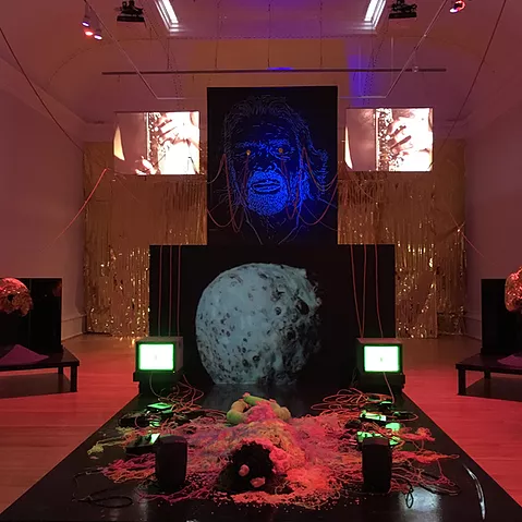
SO, but - . onto this week’s review: Benedict Drew’s exhibition Kaput at the Walker Art Gallery in Liverpool is across two rooms. The main space is lit with a mix of red and blue, and it’s fairly dark. there’s an irritating buzz vibrating the room. the big back wall is gold with tinsel door curtains. At the apex of the shape of Drew’s installation is a line drawing of Richard Branson up high, with thick red wires comin outta his face. these are draped around the room towards speakers and some chunky old TVs. In the centre of the space there’s some black structure built like a bed, and it has piles of silly string, fish tank stones, and expanding foam spilt over it, in a contained sorta way. Either side of the richard branson face are very brief and occasional projections of a man playing a saxophone. and through some plastic meat curtains in the second room, there’s a video on its own, of a (white) man’s body moving in interpretative-dance convulsions. The video cuts to leaves and lights but mainly it is the man and closeups of his back, his hands, his adam’s apple.
The press release says it’s about how richard branson is funding travel to take us to space n that is fine kk totally to my taste -
but I think the exhibition is bad ? ? I got the same feeling as when someone new makes you a ribena but they really hold bk on the cordial and it’s too weak. I got the feeling when someone gets you pyjamas for christmas that you know you are never going to wear and u are like, well what am i going to do with them now. I wondered who was to blame for my disappointment, whether it was the artist or the curator, and then I thought: there’s no one to blame, some people might like this, i am taking its badness personally.
and even though I can talk myself out of this art-upset, the tinsel is still too thin and expansive, it makes me cringe. there are no good art work treasures that compensate for the poor the level of production. there’s no poetry in the installation. There’s nothing I liked to look at, nothing I liked to hear. and I really have no fucking patience left to watch men projected huge in gallery spaces. i do not want to see their pores. all the sculptures were badly handled and annoying. and you know, everything else I’ve seen from the artist, I’ve liked. so thats annoying again. this was like the draft of an exhibition. it was like a good exhibition badly remembered and restaged by some foundation student who just discovered he could order black lights and neon paint off ebay. I say he bc it felt masc in its wavering scale, and how it feels like the artist has gotten away with something. less men everywhere generally pls. and better art instead