My Favourite Painter
ZM
I love lots of things. I love horses. I love clouds. I love dumplings. I love peach flavoured soda. I never think to question why I love these things. I don’t want to dissect them. Part of me thinks that interrogation would kill these loves. They are too unstable, irrational, inherent. So don’t ask me why I love them! I just do! I love Bhupen Khakhar. Another part of me has wanted to write about why I love Bhupen Khakhar for so long. I have put it off because I am scared that if I think too much about why, I will burst that love. The love might rupture or deflate around me. The love might dissolve away and I love loving Bhupen Khakhar. I don’t want to not love Bhupen Khakhar. But this pull: between loving something knowingly and loving something without question, that is so interesting. The things we love make us, or we love the things we love because of who we are - I can’t tell which. But you can tell who or what someone is from the things they love. I am horses I am clouds I am dumplings I am peach soda and if I am anything else, more than any of those things, I am Bhupen Khakhar.
It was June 2016. My boyfriend at the time had a Tate membership. Well… His grandma had a Tate membership. He always borrowed it so we could go to the top floor members cafe and gawk at people down on the riverbank. That was his favourite bit. But I was already an art critic. I wanted to look at art all the time and I wanted to feel something. You Can’t Please All was Tate Modern’s big summer show that year. Room after room of paintings by Bhupen Khakhar, an artist I had never heard of but felt some weird affinity with. As we walked around, I fell in love. Not with that boyfriend - I had already said iloveyou to him. I fell in love with the paintings. Love! True love! With each and every painting lined up on the wall in front of me. It was crazy. I didn’t know what was happening or how it was possible. I just knew that I was feeling something intense and real. Head over heels. This fluttering in my stomach and chest. I loved them. Truly madly deeply. I didn’t have the words to explain why. Every time I tried I came up short. Dumb love, I guess. It felt embarrassing because coming up with the words for why was my job - already an art critic and already stumbling. But it also felt telling. I couldn’t figure this love out of my body and into human words. It was pure feeling, gut instinct, animal magnetism. Have you ever tried to explain to someone why you love them? It never quite covers the ground, does it? It always feels a bit silly or flat. The feeling is always bigger than you can express.
Bhupen Khakhar was born in Bombay on 10th March 1934. He was a Pisces - the last constellation of the zodiac and a weird sign if you ask me. Pisces are open pores, mutable, romantics, so so tender. His family was Gujarati, he was the youngest son. He was never formally trained as an artist. He went to art school for a masters in Art Criticism, but before that, he trained to become a chartered accountant and he continued working as an accountant alongside his career as a painter. That choice makes me laugh a bit. I don’t know if it was a financial choice or if he just liked having the two jobs running parallel. Day as an accountant, night as a painter. Maybe it grounded him in real life, maybe it was more stable, maybe he just enjoyed bookkeeping. His painting took him back to his family’s home state of Gujarat though, and he lived and worked in Baroda where there was a busy community of artists - his friends and peers. He did other things on top of the painting and bookkeeping. He wrote short stories and plays, worked in ceramics and watercolours, made a lot of little flip out books. My favourites are still his oil paintings. I only mention the other things because I think he sounds like he was an interesting guy as well as a good artist, which is rare.
MAN EATING JALEBI (1975) The horizon line sits at the very top of the square canvas. There’s only a slither of sky and it is mostly baby blue. A hilly shoreline bends and tapers off into the sea. There are rolling green hills, baked golden on one side by the setting sun. The sky blushes packet pink above the hills, like the land is leaking or glowing. Beneath the hills there’s a cluster of boxy white buildings with orange roofs. Palm trees and grey rocks, orange sand bulging out into a thin curved beach, almost a headland at this angle from across the bay. Between us and all of that, there’s a flat smooth sea, brilliant cyan blue. It is serene, so calm and glossy. No waves, only patches in slightly different tones that skim across in wide curves. Up close in the foreground, against the very bottom right of the canvas, a man sits at a creamy beige terrazzo table. His face is a smooth salmon pink gradient. The shadows are alizarin crimson. He looks like he’s being lit from beneath. He is wearing a brown brimless hat and a striped white shirt that shimmers with pasty colour - pale blue, green, pink and yellow. His arms are propped at an angle on the table between us, broad shouldered with a pointy elbow. His hands are large and strange. The right hand is cradling a thick blue plate with one sweet, a bright orange spiral in a perfect circle - it’s a little jalebi. He is holding a second jalebi to his mouth with his left hand. His lips aren’t parted, they are thin and dark, sharp like a razor cut. He is separated from the rest of the scene by a bright red railing. Between this side of the bay and the headland on the other side, there is a thin dark highway. It cuts across the perfect blue plane of the sea, tearing it in two. A car hunkers down in the right lane on its way over to the other side. It is plastered at an odd angle.
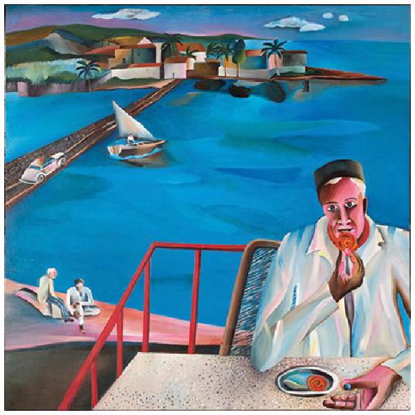
Actually, all of this painting is at an odd angle. All of it is a bit too elongated, each component stretched out in a different way. It’s like looking at something in a dream or with glasses that are ever so slightly the wrong prescription. It’s all too flat, the dimensions are too present, or not present enough. The surface of each object is too smooth. They all have a sick gradient that makes them feel bubbled and ridiculous and unreal. The space feels airbrushed, empty, distant, new. The angles are all hyperextended. It’s not uncanny but it’s also not comfortable. I don’t understand it. It’s perfect.
Like I said, I love lots of things. I don’t understand most of them. I love Mughal miniatures and Italian primitives. I love the Sienese school. I love that pre-Renaissance-late-Medieval period, just as perspective is being figured out and artists don’t quite know how they want to compose their images. They don’t quite know how they want to configure space within the limits of the canvas. It’s all up in the air. Anything goes. So composition stretches out and space contracts. Spatially speaking, things start coming undone. I love Henri Rousseau. Taste is funny, isn’t it? We all like what we like. Black bean sauce. White trainers. When people have a little pink flush across the high points of their cheeks and across their nose - ah! I love it.
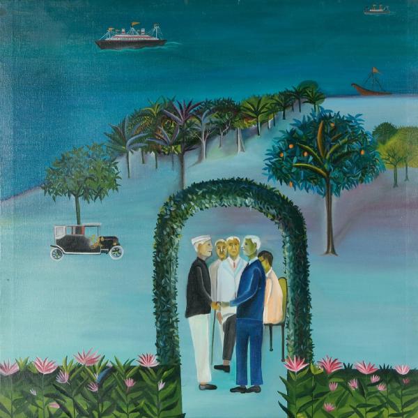
MAN LEAVING (GOING ABROAD) (1970) Overwhelmingly teal. A curved landmass like a bubble rising, cupping the sea. Darker teal. Flat except for a steam boat cutting through water on perfectly wobbled waves. On land, even rows of trees stretch back along the shore. They are spiky, succulent. The leaves are fleshy and solid. They are a dense collective unit, disappearing into the distance, shrinking. One tree stands apart, further forward and bedazzled by little orange fruits. The fruits are pushed out to meet us, prominently thrust forward over the leaves. In the foreground, a hedgerow runs along the very bottom of the square canvas in a straight line. A dense green gradient with leaves and pink lotus flowers painted over the top. The hedge parts in the middle and forms a curved arch. Two men hold hands underneath it, facing each other. They both have white hair and still, blank faces. Around them the land is minty and smooth. A flat plane of colour that rolls out, streaky in parts but mostly all encompassing. It sucks the eye in, making the figures look small and meek.
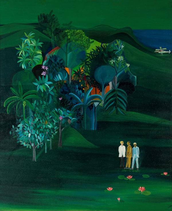
AMERICAN SURVEY OFFICER (1969) Emerald green everywhere. Trees in a lump, moving up from the middle on a diagonal path. The same pasty succulent leaves, still and perfect against rolling hills. The hills tip down towards the right of the canvas, a small creamy helicopter is perched in a dip. There’s a slice of the sea, dark and blue and barely noticeable against the rich emerald. The land spreads out into the foreground at the bottom of the canvas, a threatening flat expanse. Nearly empty. So small, they are almost swallowed up by the smooth plane of colour: three figures. They are all wearing suits. One man is facing out to look at us. He’s wearing a baby blue suit and round sunglasses. He is blonde. I think he is so glamorous against this blown out landscape, so calm against these rolling hills that are threatening to engulf him. Somewhere deep within the cluster of trees there’s a startling shock of red. Like an almost-orange, cadmium red. It is glowing out in a circle. I don’t understand what it is meant to be.
Taste is social: it is constructed on a networked scale that is bigger than us as individuals. Taste is irrational: we cannot bend it to our will because it is tied to other things. But Mughal miniatures, Italian Primitives, Henri Rousseau - all those things have something in common, don’t they? I like images where there’s an element of spatial confusion. There’s a term for it: pictorial space. It describes a painter’s conceit, that the two dimensional plane of a canvas is an illusion, that it is actually capable of conveying depth. There is foreground, middle ground, background, ground beyond and between. Things can come up close and recede back into the distance. It is a lie. I like it when the conceit slips. When a painter reveals their hand. Maybe it’s clumsy or clunky. Maybe it fails a bit. Maybe the painter lets you see what they’re doing, or trying to do. I don’t like it when things are seamless. I like the awkwardness - the embarrassment - the shy self-awareness - the nervousness - ah! Blush: cheekbone to cheekbone bridging the nose. I like the way it feels, to see an image flex out in space and for it to feel new or risky, the anxiety of not knowing whether it will work this time.
TIGER AND STAG (1970) A rectangular canvas, hung portrait. From the top down: a viridian green plane, flat expanse. Grey hills bulge up out of the green. They part in the middle to reveal a complex fort, pink and red and white with powdery blue shadows. A blue rectangular pool spreads out flat, overlooked by the fort’s domed roofs. Across the canvas, a dense patch of leaves all tangled in a curve. Then more hills. Grey fading into minty green. Some of the hills are inclines so steep, they dive up almost vertical. The light catches them pale and sickly. There’s something about mint green, it’s a colour that makes me feel nauseous. The fort, the trees and the hills. They’re all connected by red roads. This severe network of thin sharp lines that carves up the flat green expanse. At the bottom, underneath all this towering imagery, almost lost amongst it: a tiger and a stag. The stag is fleeing off to the left. The tiger is mid-pounce, baring its teeth. Its tongue is lolling out, its nose is scrunched up and short. Round head crunched up in movement and menace. Its body is stretched out and potbellied. The stag is straight faced. Its eyes are forward, almost rolling. Its tongue is flopping out of its mouth too, but in a bored way. Its head is small, body inflated and cow-like. Its legs are prancing spindles. It’s my favourite bit. The stag and the tiger are lost in the landscape and also blown out by it. They dominate the image and disappear into the baggy folds of hill road and trees. They are nowhere and foreground. There is no horizon line. I love this painting because it is tense. It is taut. It is unstable. The composition of this painting contains friction.
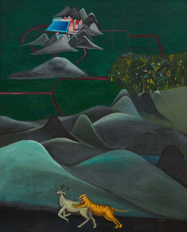
In 1972 Bhupen Khakhar had an exhibition at Gallery Chemould in Bombay. He made a catalogue to accompany the show: TRUTH IS BEAUTY AND BEAUTY IS GOD. There’s a weird and wonky biography that includes a full family tree and describes his past life as a butterfly that died when it threw itself into a saint’s lit candle. Then he offers short texts to explain each painting in the exhibition. About TIGER AND STAG, he wrote: The background of the painting is done with a two dimensional attitude while the foreground is done with a three dimensional attitude… These two sections of the painting are joined by a crimson road. This joining looks awkward, out of place, and is an unsuccessful attempt to fill up the space.
According to art history, Bhupen Khakhar admired and studied Mughal miniatures, Italian primitives, the work of Henri Rousseau. Maybe that’s the source of this weird affinity I feel with him? We have similar taste. They called Henri Rousseau a ‘Modern primitive’. Like Bhupen Khakhar, Rousseau was self-taught and came to painting relatively late in life. Before being an artist, he was a customs inspector. Modern primitive was a term that understood: his visual language sat outside the conventions of formal training or received wisdom. It was naive, sincere, deadpan, stiff, but all on purpose. Apparently it’s called gaucherie - awkwardness. That awkwardness is a visual device. It opens up new possibilities for staging a narrative or making depth within a flat image. It gives things a tense and nervous energy. It also makes things feel still. Not just in the way images are always still, but in an artificial way, like something has been called to attention. The friction of this nervous, still energy - it makes space turn into a kind of liquid.
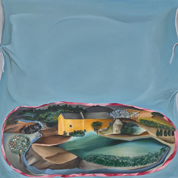
HOWARD HODGKIN’S HOUSE ON HAND PAINTED CUSHION (1979) Square canvas, dominated by powdery blue. It’s a dizzying expanse - and then it falters. Most of it is flat colour, but at the edges there are little wrinkles. Like fabric pinching, tacked on. It’s just oil paint though. Down the bottom there’s a little lozenge shaped vignette. It’s bordered by a red ribbon with this satin sheen. The landscape contracts within this contained oval. A yellow house, a winding river, flat green lawn shining under a grey sky (we can only see the smallest gash of sky, but it is gun metal grey). The house is in the middle of the vignette and it bulges out at us. The rest of the landscape warps to hug the ribbon border. The river caresses the bottom, the fields sweep round on the right and the path widens out to obscure where things end on the left. I think this is a perfect painting. Everything is smooth, edgeless. It surrenders itself to open space, flat field of colour. It interrupts itself and slits itself open: wrinkle and vignette. Space has turned itself inside out and now everything is leaking across the canvas. It has turned landscape into a work of fiction, a dream, a liquid. I think it is the most beautiful thing I have ever seen.