Concrete Pitch: Eddie Peake @ White Cube Bermondsey
ZM
Emoji summary: 🔗🔦😕
I didn’t want to like this show. I’ll be completely honest, there’s something about Eddie Peake that j makes me slightly uncomfortable. Not quite the gut refusal of a full body clench,,, alarm bells ringing. Just a slight tweak in the base of my neck,,, a stiffness in my ribs that prevents me from fully leaning in and trusting the words he says. Having said that, Concrete Pitch at the White Cube was really good and i feel like i’ve got egg on my face because of that. A hot flush - if i could blush i would.
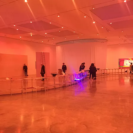
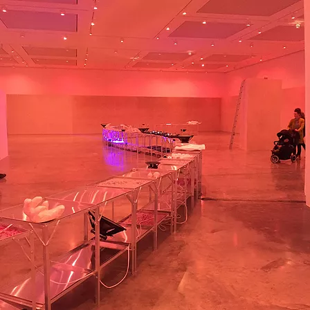
I mean, i don’t think I’ve ever gone to the white cube and been definitively into the things i saw. I was surprised to see this here and not at somewhere like,,, say chisenhale. It actually rly did feel more in keeping with something at chisenhale tbh. i found that quite bizarre, that jarring feeling of ‘what is this doing here?’ So right at the end of the building in the South Gallery, past all the weird stuff, the boring stuff, at the end of that ridiculous hallway that makes u feel like ur the size of a kinder egg toy;;;; u turn into the room and it’s this flush of soft, warm pink lights. I really did appreciate that, i think lighting is such a smooth and transitional way to transform a space and people’s experience of that space, i’m into it. no more harsh bright white lights, these following exhibitions are brought to u by phillips livingcolour lamps only from here on out. so, the pink, and then at the doorstep, to ur very left is a dark, pinched concrete tunnel, folding into a nearly point. the rest of the space opens up to you.
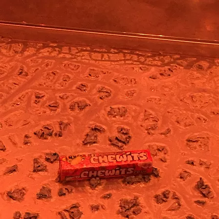
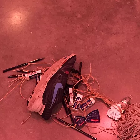
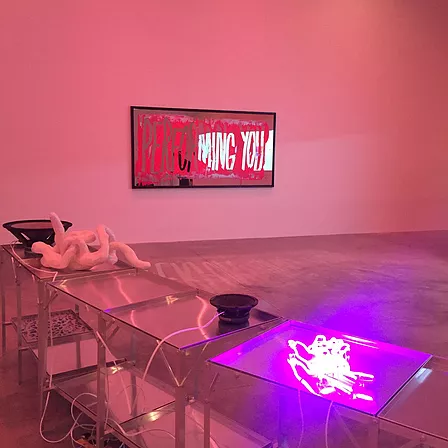
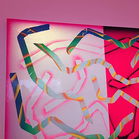
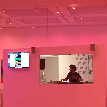
I am like low-key angry at me liking this show. Because i think Eddie Peake is good with space. Formally he knows what he is doing,,, something about aesthetic sensibility idk. In the middle of the room there was this long hip-height snake of steel tables all jammed together n it was called Stroud Green Road, and all along the table tops were like this weird red wax scraped into the surface, and packets of chewits and these lumpy white sculptures and blue neon curls,,,, it snaked its way diagonally across the massive gallery and it did something rly nice to the space. it wasn’t large really, but it made the gallery feel less vast. i didn’t feel like a kinder egg toy anymore. it helped me get my footing in the space in a generous way, as a centrepiece to anchor yourself along,,, peering over the table tops like a food inspector,, or to walk around as a pivot point . /. this long table cut the space in two, n in doing so, this massive gallery room felt a bit less intimidating. idk how or why,,, in combination with the pink and the music i think i liked what it did to the space formally and how i placed myself around it. i kinda only rly felt some type of way about it when i saw the name. i will come back to that later i think,,, for now,, the work. The wall mounted stuff could have not been there, i didn’t spend much time looking at it. i don’t know,,, if it wasn’t there, would i have missed it? i feel like maybe i was so taken by the steel snake in the middle and the use of the main body of the space, the pinched concrete tunnel in the corner, and the big white office box that Peake and the Kool FM DJs were based in,,, i didn’t find myself caring about the rest, bc it felt a bit like accessorising to me. Like i don’t look too hard at people’s earrings, i rarely notice them. I think what felt transformative and special about this room were the huge structural things,,, the things that spread out and across, and also the smaller bits, the detail stuff on the tables and the bits that lay across the floor,,, hair strokes in the big picture,,, that kinda vibe.. it felt like a nice way to level and balance it all. i didn’t care for the wall stuff or the big white shower curtain coiled in the far corner,,, they felt like perhaps a hangover from the fear of big rooms,, lumpy middle child my eyes bounced over them. As i am saying that,,, maybe the room would have been too empty without them and i am wrong. i hope i’m not,,,, but this is so about my experience of it all,,, the way i took the temperature of the room,,, wet finger to the wind of it all.
a step away from the work, i do wana talk about my uncomfortability, that feeling at the base of my neck. Bc i felt that at times in the room. The big white windowed office in the belly of the space; as i met it face on, i was uncomfortable, there was something of the human zoo about there being a DJ in there, on display. Like it was a fish tank, and we were the gawping children, clammy hands pressed against the glass, tapping rhythmically. The fact that it was a Kool FM DJ,,, playing a specific kind and flavour of music for viewers at the White Cube:: of all places,,, my hands turned into clammy fists at that. When i went round the white box, i did see that Eddie was also in the office with the DJ, but idk if that makes it any less human-zoo like, j bc he was also on display. He was like…. less on display, protected by some walls and you could only peep a small glance at him moving around. It felt uneven, less like solidarity more like a stunt. it felt kinda manipulative,,, to put urself in there too, but to make way for only your privacy,,, to force another marginalised body to perform on your behalf while kinda halfway with them,,, but not really. Like… it just made me kinda uncomfortable. And i think that is because of the artist’s identity. It feels fair to bring it up, bc bc u know why. I am made uncomfortable by the name Stroud Green Road for a work made by a white middle class artist. I feel like Eddie Peake performs a role very very well, but it is still performing and it is still a role. he is mimicking the dance moves to a song that doesn’t rly belong to him, and ye, it is problematic;;;. it is a very specific identity; that of an urban, working class,,, immigrant,, oF COLOUR community that are the collective authors of the aesthetic signifiers that Eddie Peake picks up and puts together in his work, like the cultural production of these marginalised identities is flatpack furniture. i don’t like it. i don’t like the way he talks about identity in his work, because he kinda subsumes his identity into identities that don’t have the agency to represent themselves in the spaces he’s touting them. It feels pressing to me, bc it feels like something white people in the art world do a lot. It’s not popular to be rich, so these kids that come to london art schools from the Home counties pretend an accent they didn’t grow up speaking in, they wear kangol flat caps, expensive trainers, they shop on depop for things ppl bought in JD sports. And it is the aesthetic taste of a specifically urban, working class, OF COLOUR community they are playing dress up with. This isn’t me shouting about cultural appropriation #reclaimthebindi l m a o. this is me saying that perhaps this problem of white middle class people being embarrassed about being white and middle class isn’t a solution to the problem of white middle class people ruling the art world. bc they still do rule the art world, they j aren’t rly as accountable for it anymore; bc they’ve learned how to navigate it by performing shame instead of deconstructing their identity n position when making. They wear designer streetwear, whatever the fuck that means;;; they have taken the abstract concept of what constitutes good taste from people that have been consistently marginalised for not knowing what constitutes good taste according to the art world in all the years previous. we know this, we know the art world is about soft capital; we r now not so good at holding ppl accountable for the soft capital they r jacking as soon as winds change. it runs through me, i am not happy with it, and i feel like maybe i’m not being fair,,, like i am making an example of Eddie Peake, blaming him for Hetty Douglas n the people @dankmemesforhomecountiesteens makes memes about. but with a show so public and big, it would be remiss of me not to mention this as a problem in and of itself within his work; and in the art world as a whole. I almost feel sorry, feel bad about what i’m saying. But in feeling that way, i kinda feel like i must be saying something right in some way at least.
I liked this show, i just wish it wasn’t Eddie Peake who made it. I feel bad writing that sentence, but the looming shadow of his identity felt too close to it all, too jarring when i tried to jump into it feet first. I’ll feel sorry about that sentence for a while, but not for too long. I’ll have u know, worse things get said RE: identity and the artist in the space of a review.
Concrete Pitch by Eddie Peake is on till 8th April @ White Cube Bermondsey
