Erik Van Lieshout: Three Social Works
ZM
Emoji summary: 🐱🛠😬
Ok so wot i wana talk about this week is production, or… effort. i think, who knows wot i’ll be nattering on about by the end of this.
sO, i get that space is difficult in london, everyone is cramped in on top of each other and there are never any seats on the tube when i use it. and actually finding the money to afford to make art is rly privileged bc as we all know that is an investment that has high risks n u might not make a return. BUT, i do like it when u go into a space u recognise and it is completely transformed. I like the way art can do that - that feeling when art is amped up past the realm of idk.. ~spatial gesture~ and fully thrust into something wild and big and rly sprawling. (i enjoy that audacity sometimes when art man spreads, is i guess wot i am saying) It can feel so special and spectacular and sometimes, that is such a nice thing - to be kinda stopped by the size of it all.
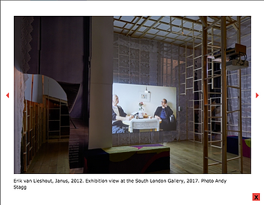
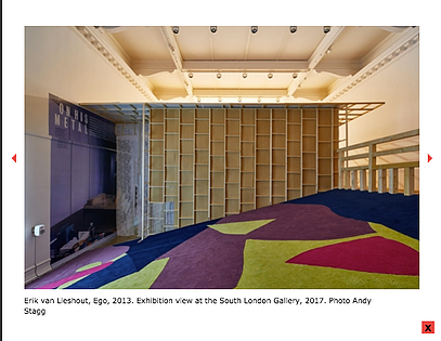
Before i talk about the actual work, i wana to talk about the way I encountered them: their lil wrapper. So… 3 social works, 3 videos about completely different things. as soon as we opened the door to the gallery, we were met by a big fuckin wall. looking up, on the big wall, straight up by the ceiling were massive words written like a punk would write it: the title of the show. that kinda grandiosity, it feels cheeky n i like cheeky. the majority of the work was how you encountered it…. the whole gallery was taken over by (idk how to word it but) a network of remodelling. it was Extreme Home Makeover wooden walls and MDF chipboard. The video about the St. Petersburg cats was down a little tunnel in the side, just like the lil tunnel the cats live in (cute). One video (Ego) was massive, being screened in front of a massive downward facing slope, kinda a sharp wooden, carpeted hill. I didn’t watch much of that bc i was lying down at the top, head on my boy’s lap and then i started rolling, and i just thought ’this is fucking embarrassing, i might as well go w it’ so i just kept rolling until i reached the bottom, and then i literally had to leave it was rly fkin awks. The first video u encounter is ‘Janus’ and it is first of all: bloody bizarre. But in comparison, it’s really unassuming compared to the surroundings of the other two. But… that unassumingness rly reels u in. Maybe the surroundings overshadow or outshine the other two works. But the surrounding wrapper for ‘Janus’ is… subtle. Set up like a lil house with pine walls and MDF sofas, net curtains. Not kitsch, just some aesthetic i think. I was taken in by the effort that went into it. I appreciated the attempt to make me feel stopped and intervened with (if that makes sense). It was nice to feel so much effort had gone into how i viewed the work, bc I get it, videos can be so long and boring and it is anxious-making for any artist working in moving image (hi, me) to think about ppl only glancing at ur work and then swiftly moving on. This MDF monster arena was the opposite end of the spectrum to a flatscreen w headphones: so unassuming and tidy. I’m into that lack of apology for its own size and girth.
So, the actual videos: the three social works were 3 videos - the videos were good, sometimes funny. That double over when art is comfortable to be around, that’s good. Not bc i feel like it should be engaging or funny to be accessible; i think that can feel condescending u know (like, ay, u don’t need the artist to be Lee Evans, slapstick hilarity to engage with some work if u don’t have an MAFA wtf) but… idk. i feel it’s nice when art relaxes in on itself - is comfortable enough in its own skin. not preoccupied with itself // self- aware // pursuing something. it feels like a kind of sincerity which i am very very obsessed with quantifying / qualifying / measuring / feeling atm - it is my word of the month (last month was tenderness, if u didn’t know)
but tbh i did feel uncomfortable around some of the works in equal measure. sometimes they made me laugh, then other times they made my bum clench. i forgot about this uncomfortability before i sat down to write this, my boy actually reminded me, he said: “i think… what was interesting about it as an experience is that the form of the work itself is so brilliant - the meta experimental documentary thing he was going for. the art is rly good - - - but these peripheral subtexts r kinda awkward. like… one of the videos is about his mum as a missionary in africa, some were like low-key kinda racist and he’s like this old white man who’s pretending to be kooky, it’s kinda like grow up. but. it was fucking good. you get me?” - the one w the mum who is a missionary in africa is ‘Ego’ and ya, what i saw made me uncomfortable. I am glad i roly poly-ed all the way down 5 minutes into watching it. I am glad my experience of it was overshadowed by my own clumsy-slapstick moment. There were some other bum-clenchy moments in ‘Janus’ - some awkward, fumbling and vaguely worrying encounters with a woman in hijab, some vague shouting of slurs (and you don’t quite know who they came from, the artist or someone else - but also, why was it there, it was just rly jarring for me)…… so, some uncomfortability. and some moments when i thought to myself: “fucking hell, this is some white nonsense isn’t it” - - - - but i haven’t quite reconciled that yt nonsense in the videos with the rly cheeky show-stopper manspread of the architecture.
Basically: these are my thoughts.
– my stand-out favourite was the video about the cats. i think more ppl should make art
for cats and then make art about the rt they made for those cats. this is a shockingly sparse genre, i would like something done about that pls.
– yes to what the press release called an “immersive architectural environment” which i will go with bc idek what else to call it, someone just went HAM with a Wickes catalogue. Yes to that and to spectacular-ity-ness
– no to the weird man-child-ness some of the videos were interlaced with. that pooped in my pudding, did not enjoy.
– i hate it when i can’t come to a definite or neat conclusion, but kids: that is life. Not everything is tied up w a neat bow, this was too complex for me to be singular here.
– if ur in London, go to this show, email us: [email protected] and let me know what you thought bc rly i truly don’t know and i would rly like to know ur thoughts so i can try and gauge where i stand in all of that
– ok, that is all, this is the end of the review. sorry it is messy af this week.
The show is on at South London Gallery till the 11th June, so u have plenty of time to email me ur thoughts. My eyes r peeled, waiting by the inbox. Rly, pls email me ur thoughts i have no clue.
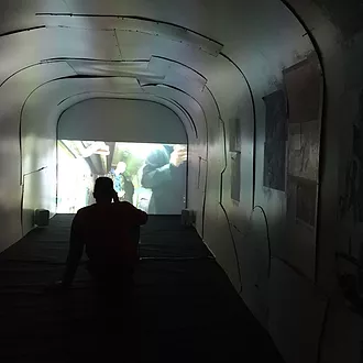
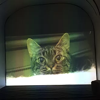
i forgot to take pictures of the other two videos, but here are some pix i lifted from the SLG site (i think bc this show is so sprawling i put these in so u know wot i’m on about):
