George Shaw at The National Gallery
Gabrielle de la Puente + Michael Lacey
‘My Back To Nature’ is frustrating. It’s an underwhelming exhibition containing all the ingredients for a much better one. The last thing I wanna do is write a bad review of an exhibition by this most genial, honest and straightforward of artists. but whatever yolo. there are two of us writing this and neither of us loved it.
It’s at the National Gallery, so there’s a weird pressure bracketing everything anyway - incarnate in the bored, snarling, power-flexing invigilators, like old Master gargoyles you have to walk past on your way in.
Shaw - Turner nominee, painter of sad contemporary urban scenes etc etc in nostalgic Humbrol enamel - has done some kinda National Gallery residency and spent time with all the weird mythical woodland paintings in their collection, finding neat, easy, commendable parallels between the comic perversity of horny satyrs and the transgressive acts which leave our woodlands now and forever strewn with condoms and empty plastic cider bottles.
There’s a wall of monochromatic works on paper - life studies, sketches of the pained expression of Our Lord & Saviour Jesus Christ with his hat of thorns, drippy ink trees also heavy with religious portent. And it’s a bad start, like the “supporting work” section of an A-Level submission, like the receipts of his residency pulled out wilted and damp from his back pocket.
And then the main room, despite containing the best work of Shaw’s career (we have decided), seems determined to mute its own impact/cockblocks itself.
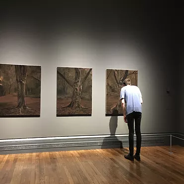
Best Work: small portraits of trees on board, conceptual simplicity, personal resonance, a lightness of touch belying the weight of importance the scenes depicted hold for him.
Assessment Feedback: Well done on these. You held the forest’s glow softly, handled it, pinched its edges without hurting its form. On these boards, you know when to be tight and when to be loose. The lilac foreground in one of those pieces, I appreciated. You are generous here, like you wanted to paint these, not like you had to do them for your homework.
BUT the larger canvas pieces often seem to dampen the light and absorb the deft brushstrokes, as well as being ** just too shiny ** to view in a dim, self-serious room with trained spotlights. Take half the work out of this exhibition and switch the lights on and GoD u would make it so much better. How is this still a problem btw, sort it out galleries, institutions etc.
Worst work: the porn mag pages scattered on the woodland floor feel particularly forced and awkward - like does this even happen now everybody has a phone? It’s revealing in a way that makes my face scrunch up. Shaw has gone out with a magazine and a camera. Out there, alone, he has ripped apart editorial porn, and arranged it over a crispy floor. He has taken a picture, picked it all up, and left. That just bums us out.
ANyway, I bought a George Shaw tea towel for my Dad, went for a nice dinner and watched The Bothersome Man in bed with a salted chocolate caramel tart we made ourselves . The film was an A, the tart was an A, too. And ye, the exhibition gets a B+.
xxx

