John Walter @ HOME, Manchester
GDLP
Emoji summary: 😦💩😣
it’s too early in the year to be having to write a review like this !! why does everything have to b so problematic. I’m just tryin to live my life n u lot keep interruptin !
hi. Last week I went to Manchester to see the sights and everything was going fiiine; the martin parr show at manchester art gallery was genuinely a pleasure, didnt even know who the lad was; I finally went to the centre for chinese contemporary art, long time overdue; and eee I even got off the train early at Deansgate to visit Castlefield only to find it was still in christmas hibernation hours (and thats my own fault for not bothering to check the website buuuut it was fine, i just played a lot of pokemon go walking between galleries and hatching my eggs). ANYWAY. last on the schedj was artist John Walter’s show at HOME and I know you all love his work but I’m here to ask in the next few hundred words: for why?
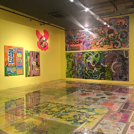
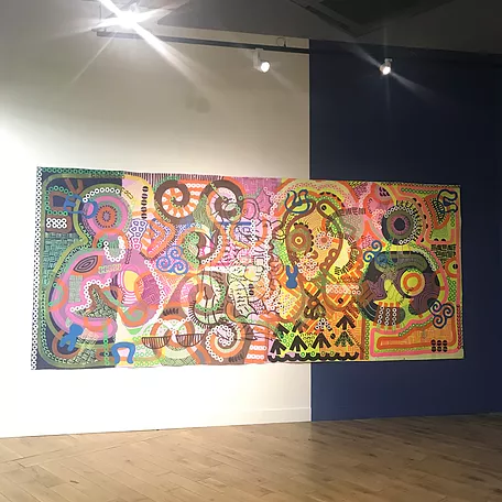
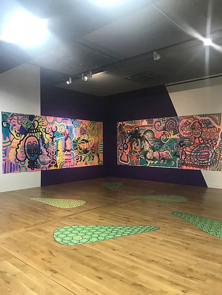
John Walter is a white british artist whose work is probably best known for engaging with the science, stigma and representation of HIV in these super bright sweet shop glue gun sentimental logo presentations. He creates full colour image-objects, installations and completely outfitted films. Big scale. the type of work you enter, move ur body around, confront. Fun for kids and fun for instagram-content-needers. I guess I have answered why people like the work but if u haven’t got a picture of it yet imagine Rachel Maclean, Ryan Trecartin, Eddie Peake and a british man’s awkwardness in a blender. I’m all for LGBT+ content and research but this is where my mouth gets messy because I want to ask if Walter’s practice is protected because of his subject? stick w me. I only ever see celebration of his work and all without question. there’s no real engaged critique that stress-tests what he’s trying to do (onlineeee. as if I read anything offline, what am I, rich?). And that’s a noted silence when I’m walking around these sticky rooms in HOME confused by the aesthetic he has chosen to speak in t b h because it is such a direct appropriation of Australian Aboriginal image composition that I’m like :O really, does no one have a problem with this? yea go ahead and make work that illustrates cell structures and processes, i’m not necessarily going to give a shit, but why do it in an aesthetic that has nothing to do with you? it’s not right, it doesn’t make sense, doesn’t help the work in any way, doesn’t make things clearer, n it doesn’t compare to the level artists like Clifford Possum Tjapaltjarri, Minnie Pwerle, Rover Thomas or Judy Watson Napangardi were working at. he’s putting their style on like a costume but he’s !white! This jigsaw of bad dot-art with polo shapes is a caricature, unconvincing, bitter. it’s katy perry’s geisha performance, taking something real and purposeful for the ease of sum quickly served pop song visuals. And i could say this in many different ways but I mostly want to know y from the artist himself: why appropriate? why not find ur own essential style?
gotta also add that after the show I was none the wiser with regards to HIV. The press release said work in this exhibition was ‘bringing new scientific knowledge about viral capsids to the attention of the wider public’ but that knowledge was so obscured in visual dress-up that I didn’t learn anything. i was speaking to my friend tom doubtfire about this issue of artists trying 2 deliver ~information~ and he put it well when he said some artists flex knowledge in a way that means they’re not even letting other people access it; they keep it to themselves by re-abstracting the piece of info they’re supposed to be relaying to the audience. Too true of this show!! trips up on its purpose because it’s self-conscious and trying to make sure it looks nice, grabbing clothes from other people’s wardrobes at random. just becomes extra uninteresting when you realise it’s not individual.
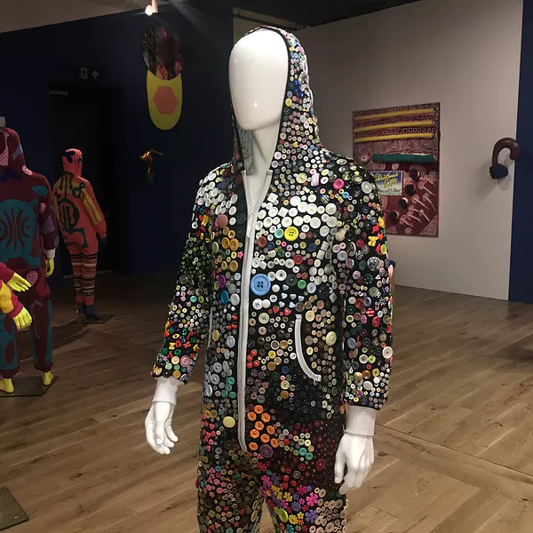
to finish, the effect as a whole was like maximalism to the point of boredom. the new HOME film commission ‘A Virus Walks Into A Bar’ was much too heavy on its Cool Arty Film handling - the edits, even the basic beat soundtrack, abrupt ending, quirky script and how slowly and out of normal human time the lines were delivered. i was squirmin. the only thing i enjoyed was the costume with millions of buttons stitched onto it because of how nice the button section is in a haberdashery. really hope john walter enlightens us all anyway. he has a good platform from which to change and maybe I’m fully missing the point and he’s not even british and his website bio is wrong. we shall see.