Landed @ Cubitt Gallery
GDLP
Emoji summary: 🏰👯🗣
Last sunday when some meetings finished earlier than expected, Zarina and I found ourselves with a free afternoon in London and went 2 hunt down some art. it was hot, like when u go to sit on a concrete bench but ur bum burns ~ back sweaty between you and ur backpack ~ levels. Not this week’s review but we did visit Auto Italia for their current exhibition Words fail me… except I didn’t understand the art or the press release, and more practically I didnt wanna comment on the theatrical Chinese figures that filled the space until i knew the race of the artist responsible n had sum peace in my heart - i got nothin from googling artist ‘Adam Gallagher’ so couldn’t move forward with my thinking. that’s fair enough to admit. We got a bus across to Angel for the current show on at Cubitt and the last by their curatorial fellow Helen Nisbet.
we bet on cubesss bc it has reliably thoughtful exhibitions. it was a humid gross day so i didnt read the press release on the way over and what i learnt was this was definitely a press release kinda show. But let me tell u my thoughts before i read anything about it at all:
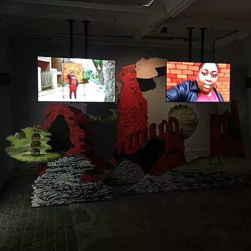
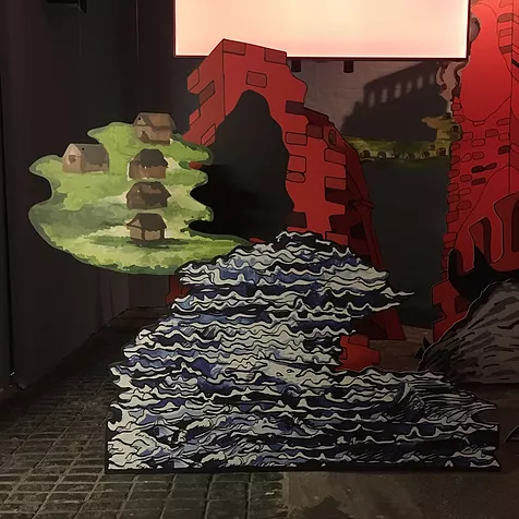
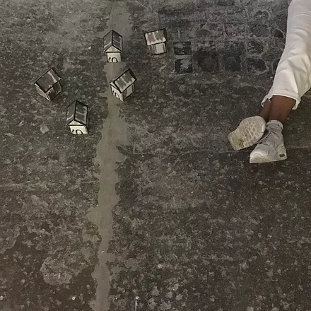
In LANDED, one half of the gallery space was filled with prop landscape cut-outs of waves, a bit of grass hanging over and behind, little houses, red castle ruins and a cloud + two channel-two screens amongst the cardboard. The video on them followed the development of a castle in the middle of a housing complex somewhere in america, and it was so weird ! cartoon-y and like, drunk reality tv show tones in how the actors spoke their way through the story of this castle coming to their community - how it could open up job opps for roles like a janitor, some security. You know how the figures in Ryan Trecartin videos speak?? Swaying between rehearsed and improvised lines. it was that, but pared down and edited, and strung together to make slightly more sense than Trecartin ever offers. And still, the castle wasn’t really getting built, it was the image of a castle (and only fragments at that) being placed in the middle of a field.
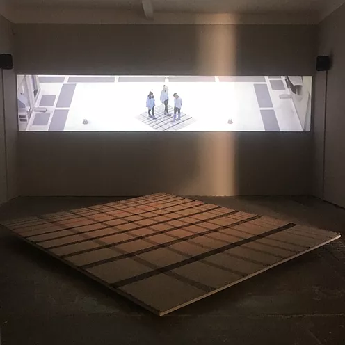
the video ended, the screens went dark, and then the OTHER half of the same gallery room lit up with a projected film and sculpture that was obviously made by a different artist. First, there was a big square sample of burberry-cum-tartan pattern on the floor, tilted below a long thin projection, three-channel. The video involved a group of people speaking in gibberish again but it was stickier and filled with theory vocab. ‘EROTICISM OF SPECIFICITY’ ‘THE ERA OF EXTRACTION’ ‘LIFE JUST AS ART IS CONSTANTLY CHANGING, IT’S AN ACCUMULATION OF PRIMITIVE FORMS.’ the people speak in dusty rocky settings and eventually they’re in formation on the top of a building, standing on the tartan square. The whole script and even the way they moved their bodies felt like the beginnings of a Three Drama Students Walk Into A Bar joke. my face was screwed up the whole time -
and when this video ended it went dark and the other half of the gallery lit up again for the castle video: they were taking turns to be the art.
I didn’t get the connection between the two works beyond maybe the performative use of language, the americanness, and I felt a bit robbed generally by the 2 for 1 art exhibition format (Tate Liverpool does it all the time, doin buy one get one free but not really getting the lipliner and lipstick combo quite right. It feels better to go full group show, full solo show, or just art that is aligned so well that bringing it together brings in a new atmosphere - when the whole is greater than the sum of its parts and so on). This is why+when i came to the press release, ready to listen to the value someone else found in the art. (it’s funny how an exhibition always feels like a promise. every time I visit one i have to remember that no one has promised me good art - no one has made it just for me, it’s not my birthday, and it’s just playin the lottery and seeing if anything comes of it).
ANSWER SECTION: the castle video installation is True Red Ruin (Elmina Castle) (2017) by Danielle Dean and the other piece was Crossed Wires (2017) by Jeanine Oleson - the accompanying sculpture the woven Perspectus…a…um (2017). Dean is taking the story of the original Elmina Castle - one of the first prefabricated buildings, from portugal, and put on the Gold Coast in Ghana, it was responsible for changing ie. colonising traditional village makeup and went on to be used as a major port during the slave trade. dean holds this narrative and shows how relevant its memory is to housing developments now during capitalism, how black bodies are moved within those structures. Ok - but idk why artworks can sound so put-together on a press release and then u see em in real life and feel embarrassed and lost standing before them. I wish the value went down easier. the work was too short and yeah, fragmented, to encompass that pain and irony. it had evaporated in its own arty-ness.
With Oleson’s work, the press release writes that the artist uses her aesthetic positions ‘to talk about labour, shared experience and the absurd conditions inherent in capitalism.’ if the curation is then about capitalism, what I felt most from that was the awkward personal space eradication of having to share a bedroom with a roommate bc u can’t afford the rent; n that being like putting two artists into the gallery where they are havin to turn around while the other undresses for bed. Not my thing, too abstract 4 me, but i never regret visiting an exhibition like this bc it feels like good critical exercise to understand my own apathy, even if it means facing a difficult review to write. And tbh as much as I ignore press releases, they can give u little lessons and help expand your brain which is a good save if the art hasn’t done the job.


