Sinae Yoo: Petrichor @ Futura, Prague
ZM
Emoji summary: ⛓🚖🌫
I should be completely honest and say that this is very much a hastily written review. Sometimes being a critic feels like a practice; I am a gardener and I am out there under the sun harvesting my thoughts as they ripen. Sometimes being a critic feels like a throwback to writing exercises at school where you’ve just gotta write something to hand in. I feel like this is the latter: I am exercising to keep myself in shape rather than tending to my roses. It’s ok, I think I am fine with that, but I feel better being up front about what this is. I am writing this on the flight back from Prague, it is Saturday, the man behind me is pressing his knees into the back of my seat, I’d rather be watching a film on my phone.
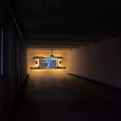
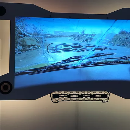
As we were wandering round a few of Prague’s galleries today, I noticed something specific about the architecture across them. I think maybe London galleries suffer a smallness, or they feel a certain pressure because of the way space is at a premium. Even the stuff that’s meant to be sparse ends up either being dense in comparison to its surroundings, or looking wasteful and petulant because of its insistence on ~space~. I don’t know if it's just the way space and access works in Prague as a city, or if it’s a hangover from Soviet era purpose built national institutions to hold art-objects - as monuments and testament both. But Prague’s galleries leaned into the idea of art in expansive space in a way that felt particular. Sparseness kinda meant something else, it was an aesthetic balance of its own and served its own definition. I was glad to have felt & witnessed the change. Sinae’s film @ Futura: Petrichor, was a projection on a large wooden, purposeful panel. It was at the end of a long and otherwise completely empty room.
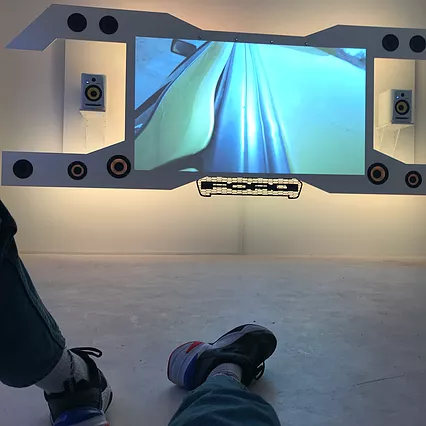
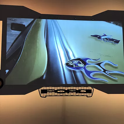
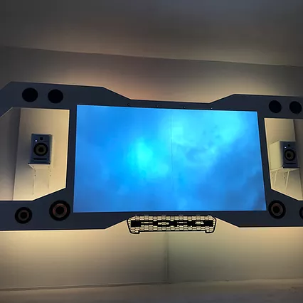
The film [was/had?] an eerie kind of surreal lyricism, pointed and loaded moments. A close up of a hand holding a cigarette that is burning from both ends. A performer walks through a petrol station, lowers cobalt blue headphones onto their ears. Another performer sits inside a car, lit up blue from an internal light; they’re singing loudly, passionately, emotionally and we can only hear the soaring symphony of the soundtrack rather than the song out of their mouth. The panel it was projected on was backlit with a buttercup yellow light, and there were these angular aerodynamic cuts out of the wood for the speakers to rest in. It was such a kinda;;; fast & furious/transformers/car boy aesthetic. I really loved its consistency, but I felt like the film wasn’t taken as far as it could go. It was part wild, this weird and wonderful meeting point for so many components I really enjoyed. Like: car adverts where the ad is trying to convey a mechanical object’s importance/necessity through emotional means. The format of Citroen ads that depict the instance of intense and revelatory emotional experiences within a car, in which you transcend past something to somewhere, because of this machine. Like: Young Thug and the aesthetic of his videos and the way he deploys images. Like: this is what I think LA must be like IRL, I don’t think public transport really actually exists in LA because I never see it on telly, in films or in vlogs. Like: Billie Eilish & that cool instagram e-girl revival of like, chains on your trousers and big big t shirts, smol smol sunglasses, and deadpan-sombre-eyes look to camera. Like: Grand Theft Auto. Like: tbh some of the moving image artwork that comes out of Central St Martins & the vocabulary this aesthetic language deploys; fetishistic obsession with metal liquidity / wet look / flame lettering / goo & slime adjacency / transparency and opacity inverse-ing. Like: Fast & Furious x queer theory politics. Like: that Balenciaga twitter advert that was too much, too soon, too all at once so familiar.
But in this, I am convinced there was something missing. Maybe it was too close to that Balenciaga advert & fashion film. Maybe it was too caught up in the aesthetic of it all?! What James Bridle once identified as the New Aesthetic (of “the increasing appearance of the visual language of digital technology and the internet in the physical world, and the blending of virtual and physical.”) has now shifted again again again and evolved to interface with a new visual frontier. Something that rests closer to the ground and a sci-fi future that is actually half-ironic, half-post-irony and tbh kinda retro in its speculative futurism. It’s an irony of ‘lmao maybe they were right in the 70s and the future is just gona be reflective glass panels, patent leather trench coats and square toe knee high boots’, but it’s actually into the aesthetic of its own joke and is THEREFORE!:: POST-IRONY. The knowing rebalanced kind of kitsch of the future-fiction, the kind of person who’s got either ⛓ or alt tiny/cursive fonts in their instagram bio.
I feel like this film leaned perhaps too heavily on an aesthetic component and something else was missing. I wanted another component, more than just iridescent soap aesthetic 3d rendered logos sheer fashion joggers and nighttime camera flash-lit scenes. Gab said she thought it felt like a halfway draft; that she wanted it to lean in more to what it was, take something further like a more booming vibrational bass, or surround sound. I agree. But I was also skimming through the press release and I read: “Petrichor is the result of a highly collaborative process with a community of artists Sinae Yoo met in Baltimore, where the film was shot. These include Elon Batile, Mathew Starke, a musician, and singer, and Keenon Brice a poet, who star in the film..” These are the performers that manifest and embody these loaded moments, that sing emotionally in the car while we can’t hear them; the soundtrack is only ever that rising orchestral symphony. And I think, for me, it’s not that the aesthetic is not enough; it’s that it’s too opaque. It references all these things that I am patient enough to unpick, but that I’m also unable to access in their entirety. I cannot really enjoy the film without a hook in, a turn down service. I want to be able to hear the performers when they speak/sing. I think that is an important moment not to obfuscate. It’s less about agency, and more about that those outputs that exist at the point of collaboration would act as a kind of genealogy for the signs, symbols, aesthetics and components being thrown at the viewer. It would act as anchor and paperweight. Not necessarily as audible only in the film, maybe it’s another appearance, maybe the film is longer and more encompassing, longer shots, subtitled (yet without coherent narrative); and as a result keeps that lawless aesthetic chaos of liquid metal sci-fi future - - - but still has backbone / textural variance.
I am glad to have seen this work. I think it challenged me and demanded I have an opinion on something I’ve only ever watched. I was glad for its insistence on position, because it means I have had to force myself to think about things that only really ever float around me as bubbles or clouds. An insistence on solidity; it would’ve been nice if that was reciprocated.
