Women on Aeroplanes @ the Showroom
ZM
Emoji summary: 🙇🏾♀🗂🌾
I can’t honestly say I’ve ever really understood the romantic pull of the archive. I have grown up in and around the internet, I don’t really remember a time before then. So, I think I am immune to the ideas of saturation and collection;; both of these feel kinda key to the archive’s romanticism. I mean, i get it, over time I have seen people exercise this romanticism well. I have felt proximity to it // I have felt its goodness & its nutrition // i have witnessed it being utilised in a specific radicality. But i think I move too fast, i skim read everything, I smoke while walking, i eat my breakfast with my laptop open. Women on aeroplanes has been on at the Showroom since the 3rd of October. Slow-cooker, hotpot, Winter Stew; it’s been simmering away while I was out.
A group show on a level that feels balanced, a tiny bite to taste; there are only 3 artists in this show. I really like that. It’s pared back in a way group shows never are, a mediated encounter that accounts for the room everyone needs to stretch their legs. Like, that is well enough space for each artist to do something meaningful, something affective (maybe in a varying way, some linear, some soft to touch). I am glad to have seen this show if only for that format.
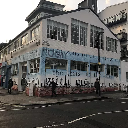
To walk you through: I walked up from Edgware Road, turned the corner down to Penfold street and walked along, past the market. As you walk up to the gallery building, you see Pamela Phatsimo Sunstrum’s full-scale mural on the exterior. Baby-boy-blue washed sky ambles down to a terracotta orange earth; on the horizon line little charcoal grey mountains bend and flex, and beneath them the ground is peppered with an arial view of blank white houses, dusty grey hedgerows and darker fields. There’s text against the landscape, from top to bottom reads: ‘to the stars to the stars to the stars // there with me // to the stars’. Ngl, it’s beautiful. Murals are, in my mind, normally bad examples of public art - designed by committee - or worse, one person flexing by putting one line of disappointing text on a wall. A mediocre aphorism towering over all. Pamela’s mural was a good reason to stop and stare before i crossed the road. A good example, placed in stark contrast to the aforementioned mediocre aphorism down the road (on the corner of Penfold Street and Bell Street, next to Lisson Gallery, is a mural by Laure Prouvost that reads: ‘Ideally this corner // would embrace you warmly’ in thick white all caps text against a stark black background).
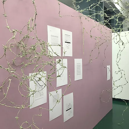
And so you walk in through the entrance on Penfold Street, and immediately there’s a wall to your left, funnelling you into the gallery like a hallway; all baby-girl-pink. This is Lungiswa Gqunta’s installation & drawings. These spidery off-white clusters bunch up at the top of the walls, forming a canopy. The press release says its barbed wire wrapped in cotton-sheeting, but it reminds me of the white bits when you peel an orange. I always peel off those bits meticulously, they make me feel ill to look at and touch them, they always get trapped under my nails or stick to my fingertips. So then, this is a very weighted subjective criticism of them, but I do think I’ve noticed that sometimes the Showroom is a fan of showing work that’s ~crafty~ rather than ~arty~. Where aesthetic is kinda knocked off-kilter to include something maybe less trendy in its considerations; bc the barbed wire with the pink walls felt old-fashioned. But in saying that, I also do recognise that that exact trendy aesthetic language is bullshit, nothing more than soft implicit gatekeeping, and i rly respect this pattern the Showroom has of weaving different formal flavours. I am angry at myself for feeling sick, and for wanting the drawings only. I don’t know what I want, or what I want isn’t always what’s best; I am often ok with being told ‘no, you’ll have this instead’ bc it’s rarely ever that deep.
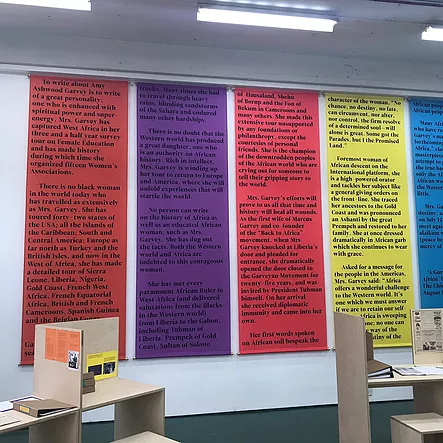
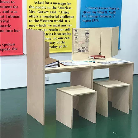
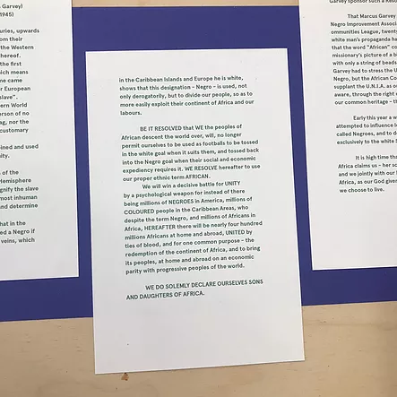
And round the corner, in the prime chunk of the gallery, is a sprawling layout. On the far wall, 5 banners , and on the floor in-between are 5 plywood desks with different flip & fold add-ons. This is all Emma Wolukau-Wanambwa’s installation, a manifestation of what i can only imagine is years of research into the life and work of Amy Ashwood Garvey. This chunk, this lump, this behemoth, the trailing of a woman who was spectacular, a Pan-African activist, a political force for Good, fierce and incredible. I think this is where I understand the romance of the archive; in its power to remember & resurrect. Where sometimes film is too linear and didactic, where an essay is the same and also j not enough, the archive is ripe to be instrumentalised as a loose format. to be pulled from, to aestheticise for display, to build a tenderness in approach, experience and mediation. For me, this work was the star of the show. Complex, time-worthy, dense but not opaque n solid, not abstracted. A good curatorial format tbh! non-linear, embracing of multitudes (in format, sources, voices, perspectives, time, solidity) and clear; not didactic, not single-monotone inscription of how to read it. It was good, interesting, uninstagrammable, but not ugly. I think Gab wrote about this well when she wrote about The Place is Here at MIMA; the quality of a non-passive image experience that demands a strictness from the audience. This was similar, maybe less formal, but absorbing nonetheless. A powerful pull of a good speaker; a compelling tale, a clever way to get you to learn while letting you find out for yourself. I think it’s entirely possible you could pop in for 5 minutes and get nothing out of this work; but i stayed for an hour and pulled every thread, juiced every bit of fleshy pulp.
My favourite encounter was with a short essay written by the artist, called ‘Cavalry’. Its back page is glued to the desk surface, so you must sit & read. Landscape & book format, it tells of Emma’s experience looking for Amy Ashwood Garvey’s grave in Cavalry Cemetery, Kingston, Jamaica. I don’t want to describe it, or its affect. I just want it to sit with me for a bit. Idk how i feel about short stories as a format, if this was more of a short story than an essay, but i loved it. It was tender, personal. the whole show was tbh, but especially Emma’s work. on one of the tables there was a school exercise book with a pen attached to it. The inside cover had a note that read: ‘WHAT ELSE SHOULD PEOPLE KNOW? HOW CAN THAT KNOWLEDGE BE SHARED?’ and on the facing front page, someone had written: ‘Very interesting that the history of 20thC aggregated so much in large scale movements - how an individual studied can help create a more discrete understanding’. And that’s it, isn’t it? that’s better than my whole review; a more discrete understanding.
Women on Aeroplanes was co-curated by Otolith Collective, and 'forms part of an international project of the same name curated by Annett Busch, Marie-Hélène Gutberlet and Magda Lipska'. It's on @ the Showroom until Saturday 26th January.
