the loopiest paintings italy has to offer
ZM
1: The Blessed Agostino Novello Triptych // Simone Martini
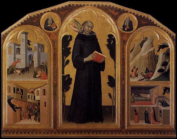
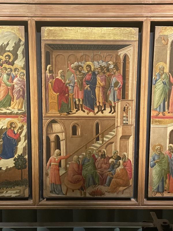
Silly of me to start with this one bc I actually can’t write too much about this here (pls wait for next Sunday, thank you for your patience). But I can’t not start with it, because the panel with St Agostino swooping down to catch the child falling from the balcony »»
Wait, a better pic from google:::
that panel is my favourite painting in the entire world. Ever. My top number one of all time. Best thing I’ve ever seen. Want to get it tattooed on my back so I can carry it around with me. Ayyyy I love it. I’ll tell you why next Sunday shhhhh.
2: Maesta // Duccio
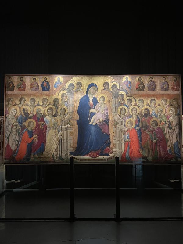
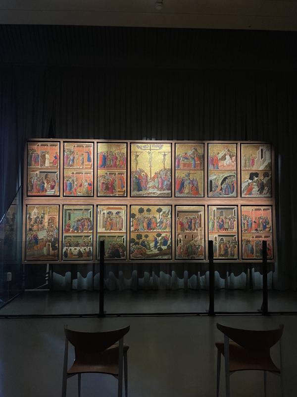
If I was committed to telling you art historical fun facts, I’d say that this painting is the most important painting in Italy and I’d tell you why. I don’t care too much about the why though. IRL this painting had like a crackling energy. Dark room and hushed voices, it is enormous and impressive and intimately teeny tiny all at the same time. Duccio painted this when he was well established as Siena’s foremost talent. Back in the 1300s, when this painting was finished, it was paraded through the streets of Siena - from the artist’s workshop to the cathedral it was made for. People followed the procession with candles. The shops closed and people who lived on the procession route hung lovely silks from their balconies. Imagine: you’re a resident of the city-state of Siena in the 1300s. You don’t see images like that. The world just unfolds before you. There’s no internet, no instagram, no photography. Paintings are rare and special. They are in important buildings like the church and the public buildings from which your state is governed. Then this 6 by 6 meter masterpiece, in dazzling gold, lurid colour - christ, madonna and all the saints - it travels past your front door. I think it’d make my brain melt. i think I’d lose my mind. Idk- I think I mostly like the story around this painting. I like the idea that a painting could mean so much for a city that the people of the city would willingly parade it through the streets. I like the idea of a painting being exhaled in that way. It feels sweet, special, emotional. I also like the painting itself. The scenes from the passion on the back of the maesta are beautiful, bonkers, vibey as hell. They do this weird twisting turning thing with the space. I think that’s where the art historical importance is, but it’s also where the energy is. On the back, always on the back.
3: Madonna del Latte // Ambrogio Lorenzetti
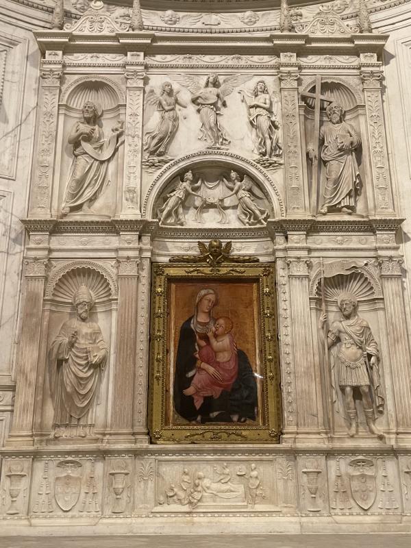
On its own, this is just a beautiful painting. But there was something about the scale of it in the big church: the grandeur felt so baggy around it. It felt so small and intimate and handheld. Portable?? Idk. Both virgin & child are looking out at the viewer, Christ’s hand is squeezing his mum’s bare tit. Her front hand flattens out into long terrifying spindly fingers. This thing has got energy for me - BIG TIME. I like the way the figures feel staticky - like if you touch them they’d zap you. I like the confidence this has in its unfaltering gaze. I like the way their fleshy faces feel rosy and warm. The way Christ’s foot is pushing his mum’s arm out and away, but also pushing out at us. It pulls me in a tells me to fuck off. I love it!!!!!!
4: Madonna dei francescani // Duccio
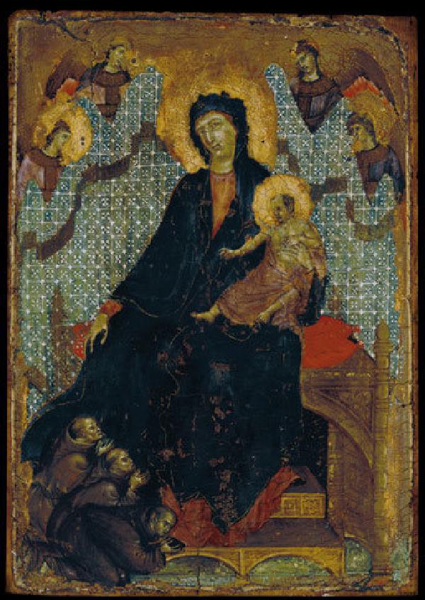
This painting is so small. It’s barely the size of an airport paperback. It is teeny tiny. I was inches - INCHES!!! - away from it in the gallery. My nose was basically brushing against the glass. It is beautiful and ruined. The madonna’s face and the grimacing faces of the worshippers at her feet are the only things left in clarity. Her robes tumble down to her feet like an expanse threatening to engulf them & us. The angels holding up the sheet behind her are crumby but they still push her out, swallow up the rest of the remaining space. It’s a really dizzying painting because it is so small and it sucks you in. The space is just a myth. It’s a vacuum imo. Just not there even though it should be.
5: The Madonna appears to Pope Calixtus III (Maria asks for help for the city of Siena in the famine of 1455) // Sano di Pietro
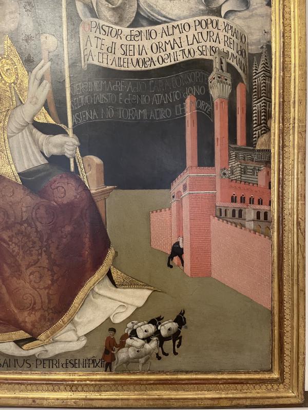
I just like the way scale has been warped in this painting. It feels like a dream or like a surrealist masterpiece. It feels like fiction. Silly! Kinda whimsical. But then also deadly serious - important but energetic
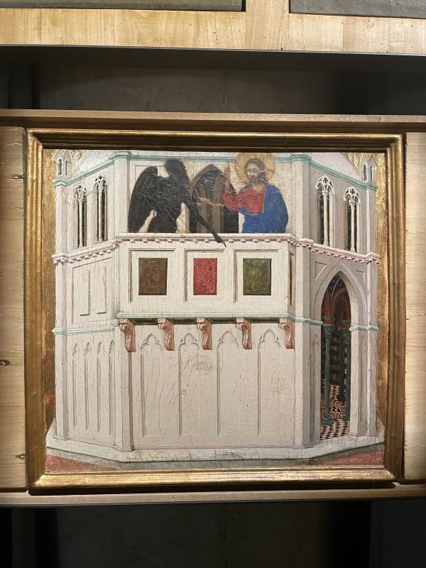
6: city on the sea // Stefano di Giovanni
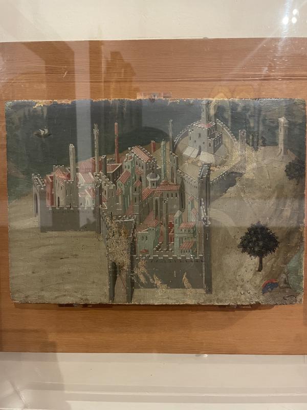
Crazy!!!!! I hope you can see it through the glare. This is just a really good painting of a city by the sea, but space is simply a dissolving myth around the hinges of each angle. It makes me feel woozy —— I LOVE it.
7: Adoration of the Magi // Lorenzo Monaco
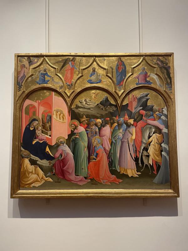
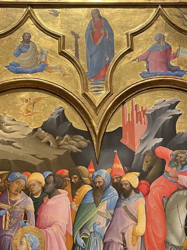
This wasn’t in Siena, this was in the Ufizzi in Florence, but !!!! I think it’s a painting from the Sienese school? I love the way the space bends around the figures, the way the composition feels like the land is gathering up to cocoon the scene. I like the faces, the expressions, I like the way architecture is rendered. I like this painting!!!
ALSO WORTH MENTIONING
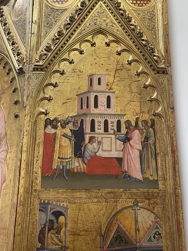
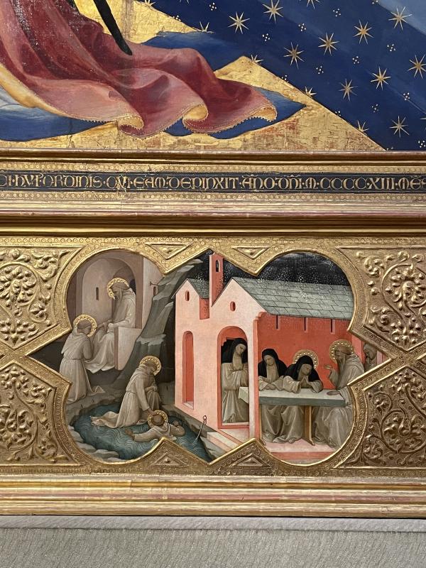
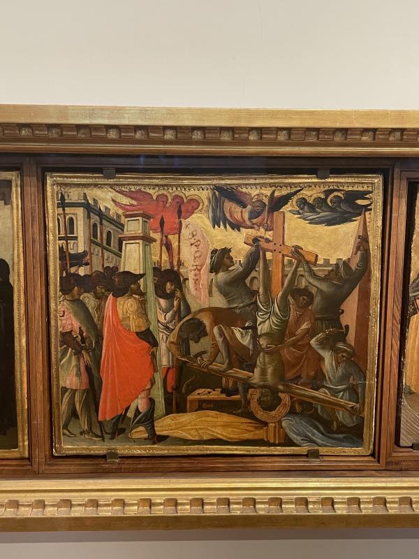
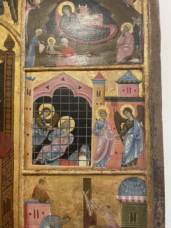
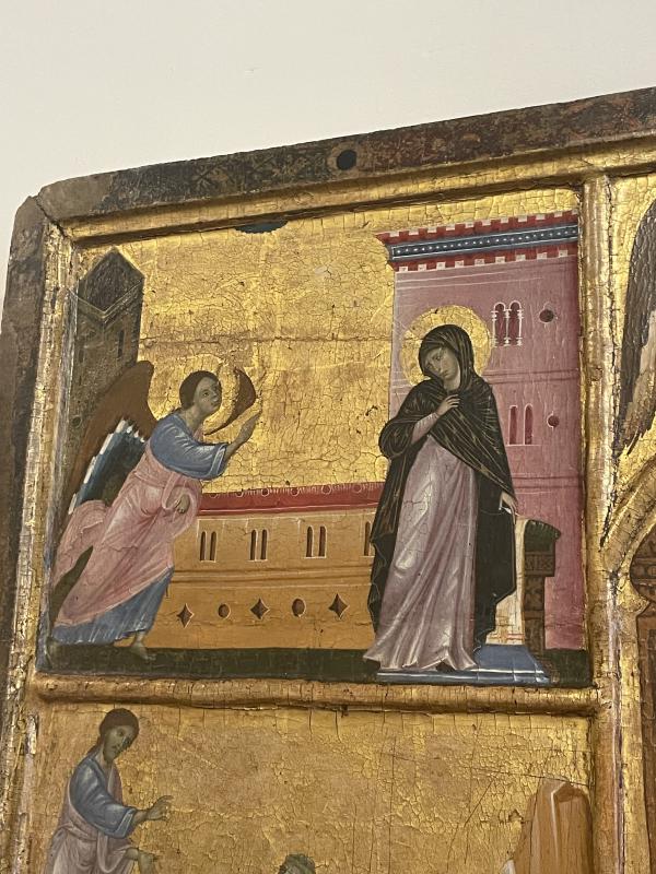
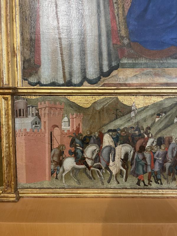
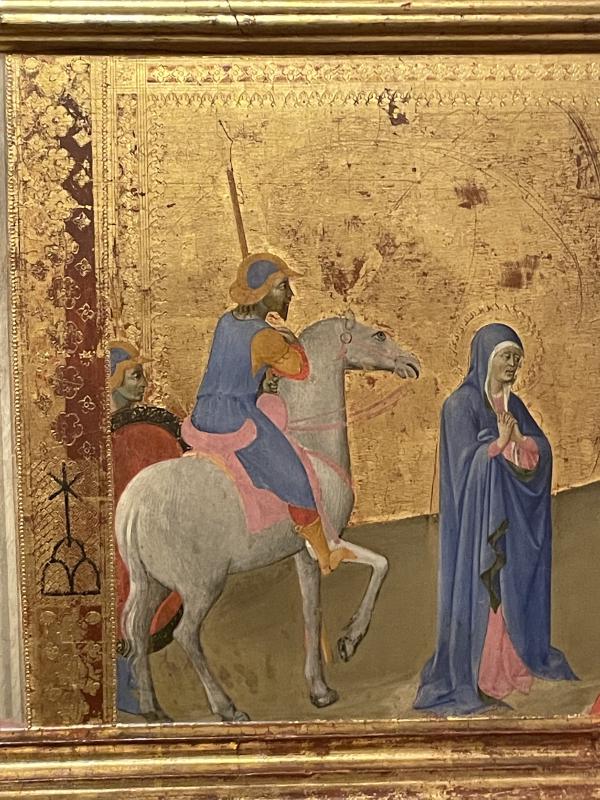
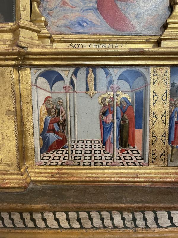
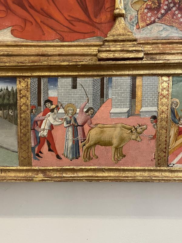
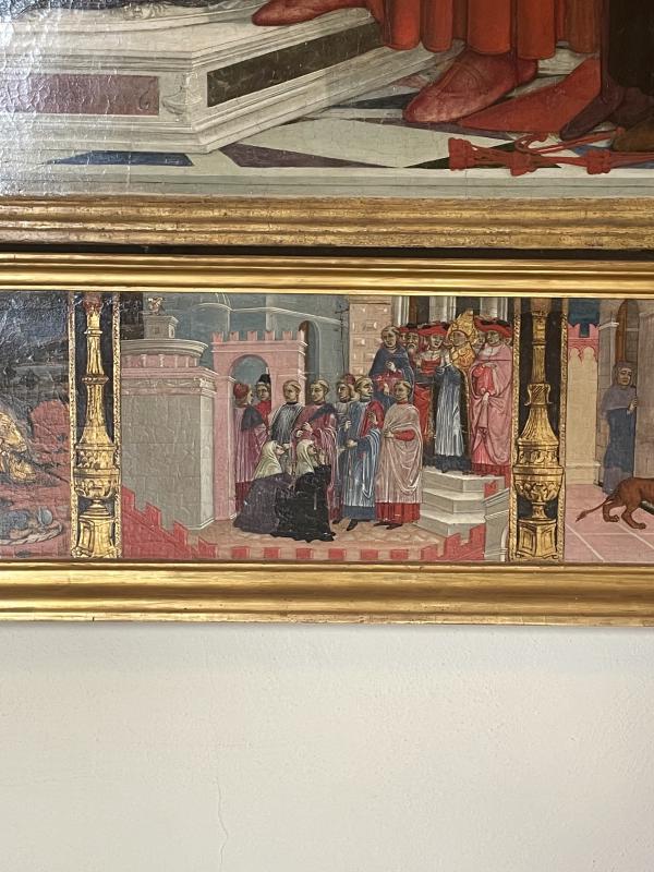
I think after traipsing round looking at endless altarpieces, I really noticed that the margins and side panels was a space where artists could go a bit nuts. Because if the main panel is for Jesus / Mary, the crucifixion, annunciation, resurrection, christ the redeemer - only so much you can do with that space. But the MARGINS!!! Artists could really do whatever there. So here are my favourite little obscure scenes from the snippets, the predellas, the margins and side panels.
ALSO ALSO
That’s all!!! Longest blog I’ve ever written whewwww. god bless u for making it this far, maybe u deserve a lil emoji game treat for the ig comments as a congrats for ur endurance. soooooo is u made it this far whack a 🍦 lil ice cream emoji 🍦 in the ig comments on today’s post about this blog/the paintings. & stay tuned for more painting thoughts next Sunday & bye xxxxxxx